
Fun with Color Palettes
/A note from the planner:
Over the years, I’ve learned that choosing wedding colors isn’t just about what looks pretty on Pinterest — it’s about intention, guest experience, and how those colors show up in real life. I’ve refreshed this post to reflect how we now guide couples through color palettes in a way that feels cohesive, timeless, and true to who they are.
Color Sets the Mood Long Before the Ceremony
Color affects how your wedding feels just as much as how it looks. Warm tones tend to feel inviting and celebratory, while cooler palettes often feel calm or modern. Deeper, moodier colors can create drama, while softer neutrals bring a sense of ease.
When we help couples think through color palettes now, we’re looking beyond individual details and thinking about the guest experience as a whole — how the space feels during cocktail hour, how lighting changes the room during dinner, and how everything comes together once the dance floor opens. The goal is for color to support the energy of the day, not compete with it.
Your Palette Is a Framework, Not a Rulebook
Your color palette should make decisions easier, not more stressful. One of the most common things we see is couples feeling boxed in by their palette, like every detail has to match perfectly — and that’s usually when design starts to feel forced.
Instead, we encourage a little flexibility. A strong palette gives your wedding direction, but it still leaves room for your vendor team — especially your planner, florist, and rental partners — to interpret those colors in a way that feels natural and layered. That’s what creates depth and keeps the overall look from feeling too “matchy.”
Choosing Colors That Photograph Well
It’s also important to think about how your colors will translate in photos. Some tones photograph beautifully in natural light, while others can feel heavy or overpowering once captured on camera.
Neutrals, softened hues, and organic textures tend to hold up well across different lighting conditions and seasons. That doesn’t mean you have to avoid bold color altogether — it just means using it intentionally and in balance with your space and lighting so the focus stays on the moments, not the palette.
When done well, your color palette should quietly support the day — not be the thing you’re worrying about once guests arrive.
Original article posted May 2021


Hey y’all,
I’ve been on an inspiration kick lately & have sought out (or had the palettes given to me) the most popular colors in our little corner of the wedding world right now.
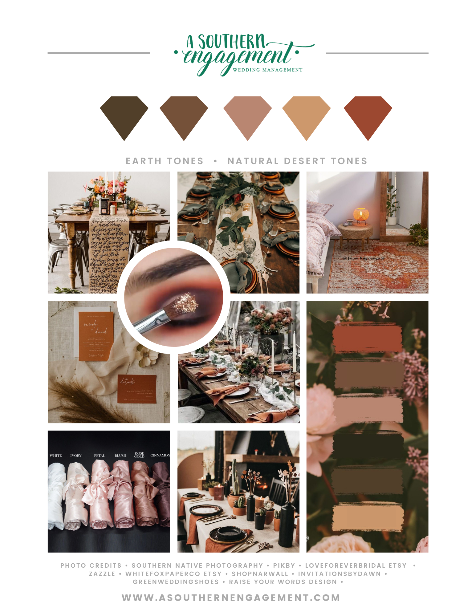
It’s very on trend to see weddings with terracotta or rust and also sage green so there are several palettes focused on at least one of the colors in the following inspo boards.
This board went on to inspire more of a blue and copper theme.

I started with an inspiration board from a previous event as the palette fits this same type of rust & green theme.
However Rust/Terracotta is such a fun neutral color that can lend itself to a wide array of design ideas so we went back to the popular rust & green and came up with this gem.
And next I was hit with inspiration to take this theme and give it a bit more moodiness. So I ended up with more neutrals and warm earth tones.
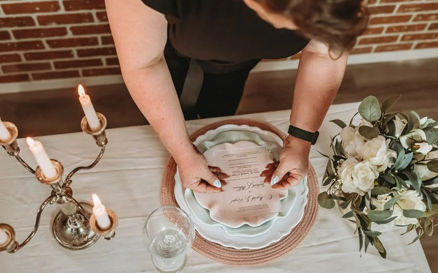
Seriously, how gorgeous are these?! These earth or desert tones can really warm up a room or accent a beautiful industrial brick scene. I know we have several local venues that would be the perfect backdrop for such drama!


But going back a bit to the desert green colors I was finding, and despite the fact that yellow is certainly not a favorite of mine, I ended up completely inspired to make this board. To me it’s the perfect end of summer, beginning of fall where it’s still too warm for our favorite comfy sweaters, leggings, boots and warm mugs of tea & coffee. It’s kind of like a “goodbye, summer” until we meet again type of theme.
Once I got into my feels about how much I love Autumn, it’s my second favorite season after all, I was presented with another bright desert color - turquoise! This time I wanted to do justice and darken to a teal and bring back our sage green.
The funny thing I noticed while working on this board was that there are plenty of times that our home decor can inspire our wedding aesthetic. These paint cards have so many luxurious feeling room ideas swirling in my brain. And yes, if you are asking my wedding colors and my interior house decor are extremely similar. There are a few reasons that I found this amusing. Number 1 and the biggest thing I tell all my clients, is that I am NOT a designer by any means. That was always one of my mom’s best qualities. My kids can all attest to the fact that I like simple designs and my husband likes much more ornate details and he has designed most of our home decor.
Do you find that your home and wedding colors line up? Leave a comment and let me know. I’m truly curious if there’s any correlation to this idea
Until next time!
Cheers 🥂
Kimberly

I’m back again with some more beautiful wedding inspiration.
This week I’m focused on the beauty that is Spring. We’ve just witnessed another beautiful Derby race day here in Louisville and the fashion inspiration that comes along with it.