
Wedding Design Is Changing
/Honeycomb, Hexagons, and Cherries Are Just the Beginning of a Warmer, More Expressive Design Era
Call it a prediction if you want, but I really do think this is where wedding design is headed next.
The next wave of wedding design is not just going to be pretty. It is going to feel warmer, earthier, and more emotionally familiar. It is going to lean into motifs that remind us of nature, memory, sweetness, and simplicity without turning the whole wedding into a theme.
Because if we are being honest, wedding design has leaned hard into polish for a while now. Clean palettes. Soft neutrals. Minimal signage. Toned-down florals. Beautiful, yes. Timeless, sometimes. But also a little same-y after a while. A lot of weddings have started to feel like they came from the same saved folder, just with slightly different flowers and a different cake shape.
And I think couples are starting to feel that too.
They still want beautiful. They still want elevated. But I think more people are craving design that feels like it has a pulse. Design that feels grounded instead of mass-produced. Collected instead of copied. They want texture, symbolism, and details that feel like they came from somewhere real.
That is where motifs come in.
Honey. Honeycomb. Hexagons. Cherries.
I know. Stay with me.
At first glance, that sounds like I pulled a trend forecast out of a very specific fever dream. But these motifs tap into something deeper than surface-level style. They feel organic. Familiar. Rooted. They call back to gardens, orchards, heirloom kitchens, old wood tables, golden-hour gatherings, handmade details, and beauty that feels just a little less digital.
That is what makes them interesting right now.
This is not about literal themed weddings. It is not about turning your reception into a beekeeper’s convention or tossing cartoon cherries all over your bar cart. It is about using motifs as a design language. A quiet visual thread. A way to make a wedding feel more personal, memorable, and emotionally rich without beating people over the head with the concept.
Less copy-paste pretty. More texture, symbolism, and details that feel like they actually came from somewhere.
Why Symbolic Motifs Are Replacing Generic Decor
For a while, color palette was doing a lot of heavy lifting.
And listen, I love a good palette. Color matters. Tone matters. The right combination of shades can completely change the mood of a wedding. But color alone does not always create depth. It does not always create personality. It does not always create the kind of visual story people remember later.
The weddings that stick with you usually have something more. Not necessarily a theme, but a point of view. A thread running through them. A sense that the details belong together for a reason.
That is what a motif can do when it is handled well.
It gives the design something to anchor to. It helps the invitation, tabletop, favors, bar styling, cake, and overall atmosphere feel like they are all living in the same world.
And right now, I think couples are craving that kind of world-building more than they even realize.
Not in a gimmicky way. In a human way.
There is a difference between beautiful details and meaningful details. The weddings that feel the most special usually manage to be both. They do not just look nice. They feel like they mean something, even if guests cannot fully explain why.
Part of that is bigger than weddings. We are all swimming in a sea of perfectly optimized visuals, algorithm-approved aesthetics, and viral sameness. So of course people are starting to hunger for design that feels more tactile, more sensory, and more connected to memory, nature, and actual soul.
That is why motifs like honeycomb, hexagons, and cherries feel different right now. They do not just look cute. They feel familiar in a way that is emotional, earthy, and quietly nostalgic.
Fresh fruit. Warm honey. Garden air. Old recipes. Summer tables. Handmade touches. Sweetness that feels natural instead of manufactured.
And in a wedding world that has had a lot of polished sameness lately, that kind of emotional texture matters.
Why Bees, Honey, and Hexagons Feel Fresh Again
Let’s start with the bee side of things, because this one could go wrong very fast in the hands of the wrong Pinterest board.
But when it is done well, it is gorgeous.
Bees and honey are naturally symbolic, which makes them especially interesting in a wedding setting. They suggest community, devotion, abundance, sweetness, home, and the beauty of building something together. That is already a strong emotional foundation before you ever get to the visuals.
And visually, these motifs bring warmth with them.
Honey tones are rich without being heavy. Golden without feeling gaudy. They sit beautifully with creams, wheats, ivories, softened greens, warm woods, brass, amber glass, and candlelight. They have an old-world quality that feels refined and comforting at the same time.
There is something almost ancient about them. Something seasonal, handmade, and earned. Honey does not feel slick. It feels gathered. Bees do not feel ornamental. They feel purposeful.
Then you get to hexagons, and that is where things start to feel editorial instead of overly literal.
A hexagon can show up in invitation design, escort displays, menu shapes, bar styling, signage, tabletop moments, or favors. It nods to honeycomb without requiring a single obvious bee icon in sight. That is the sweet spot.
Because the best version of this trend is not obvious. It is layered.
It might look like amber votives, warm neutrals, soft linen, garden textures, a custom crest with the tiniest bee tucked into it, a honey favor at each place setting, and a hexagon escort board that feels architectural and romantic all at once. That is a world. That is not a theme.
And I think that is exactly why this motif family is about to resonate more broadly. Couples want symbolism, but they do not want cheesy. They want warmth, but they do not want dated. Bees, honey, and hexagons can absolutely give them that middle ground when the design stays thoughtful.
Why Cherries Are Coming In Hot
Now let’s talk cherries, because the energy here is a little different, but it is still part of the same larger shift.
If honey and honeycomb feel grounded and storied, cherries feel flirtier, cheekier, and a little more fashion-forward. They do not carry the same symbolism, but they tap into the same craving for familiarity, personality, and visual richness.
Cherries feel like summer. Dessert. Lipstick. Vintage packaging. Cocktail garnishes. Glossy red accents that refuse to behave.
For years, wedding design has often leaned safe. Soft. Blended. Subtle. Again, beautiful, yes. But not always memorable. Cherries interrupt that in the best way. They bring life, color, contrast, and a little bit of sass. They remind us that elegance does not have to be beige and emotionally restrained.
And even with all that personality, cherries still connect to something familiar. That is why they work.
They feel like a cousin to the bow trend in some ways. Playful. Feminine. A little flirty. But with more edge. More color. More life.
Think about all the ways cherries can show up without taking over everything. A bar moment with glossy cherry garnishes. A deep red cake accent. A welcome party invitation with a subtle fruit illustration. Cocktail napkins that wink instead of scream. Rich red glassware against butter tones, blush, or cream.
That is not a cherry-themed wedding. That is a design point of view.
How to Use These Motifs Without Making the Whole Wedding Feel Like a Costume
This is where restraint saves everybody.
Because the difference between a motif and a theme is everything.
A motif is a thread. A nod. A recurring detail that helps a wedding feel cohesive and intentional.
A theme, when done badly, starts to feel like a costume.
And your wedding deserves better than that.
The goal is not for guests to walk in and immediately clock the concept. The goal is for the details to feel connected in a way that is subtle and beautiful. You want people to feel the warmth, the sweetness, the shape language, the mood, and the richness. Not feel like they got hit in the face with a branded package.
That means restraint matters.
Choose a few places where the motif can shine and let everything else support it. Trust texture, color, shape, and material to do some of the storytelling instead of relying on obvious icons at every turn.
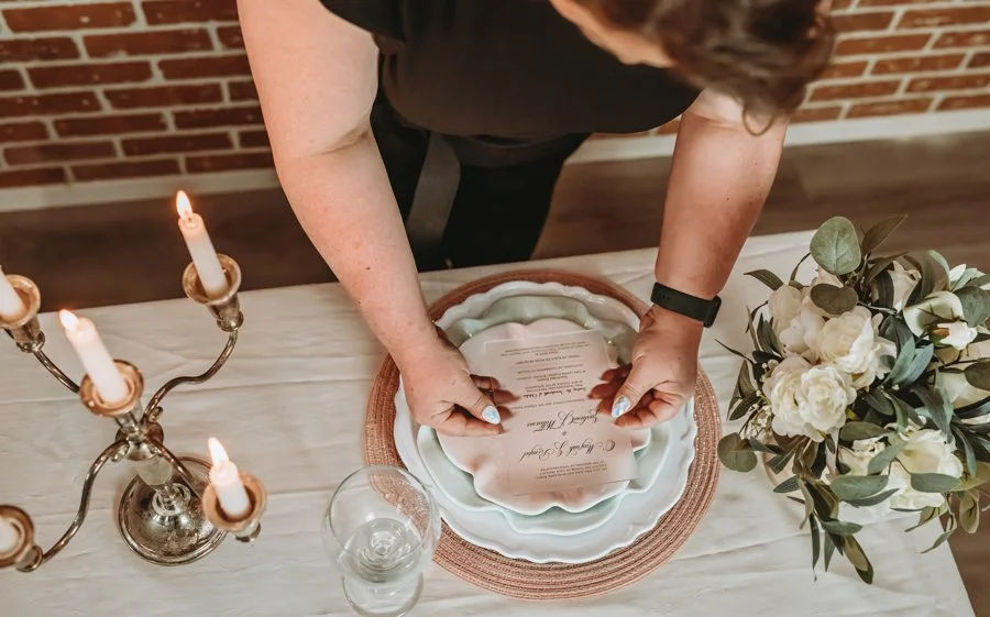
For honey and honeycomb-inspired design, that might mean warm amber tones, layered candlelight, a hexagon shape worked into signage, a honey favor, and one tiny illustrative detail on paper goods. That is enough.
For cherry-inspired design, it might mean rich red accents, fruit-forward bar styling, one playful paper element, and a cake or dessert moment that leans into the motif without going full novelty. Again, enough.
The minute every single detail starts yelling the same idea, you lose the elegance.
The best weddings that use motifs well feel like they have memory in them. They feel collected. Chosen. Intentional. Not dumped from a search results page into a cart at 2 a.m.
A wedding should feel inspired, not merchandised.
What to Watch For Next
If I am right about this, these motifs are going to show up in the places that shape the emotional texture of a wedding, not just the obvious decor moments.
You will see them in paper goods first. Invitation suites, menu cards, escort displays, wax seals, crests, custom monograms, table numbers. Easy places for motif language to sneak in quietly. A hexagon silhouette. A tiny illustrative detail in a crest. A cherry accent in a welcome party suite. A warm honeyed palette behind the paper itself.
You will see them in cakes and desserts too, not in a novelty way, but through texture, finish, color, and styling. Cherries lend themselves beautifully to glossy red details, vintage-inspired piping, and fruit-topped designs. Honey and honeycomb motifs can show up through golden glaze tones, hexagonal texture, and warm sugar work.
Bar styling is another obvious spot. Cherries are already at home there. Honey is too. Signature cocktails, garnish moments, menu illustrations, tonal glassware, and little details around color and flavor.
Favors and welcome gifting make sense too. Mini honey jars. Small-batch food gifts. Motif-led packaging. Things that feel tangible, thoughtful, and specific.
And then there is fashion. Red accessories. Gold details. Fruit-inspired jewelry. Little nods in shoes, bags, or rehearsal dinner styling.
But underneath all of this, I think the bigger shift is simple.
We are moving away from weddings that feel like mood boards and toward weddings that feel like worlds.
Less “we picked dusty blue and called it a day.” More “we built a celebration around warmth, memory, texture, and details that actually say something.”
That is the shift.
One Final Thought
I do not think couples are just looking for pretty anymore. Or at least, not only pretty.
They want weddings that feel warmer, more expressive, and more emotionally familiar. Weddings that still feel elevated, but not so polished that all the personality gets scrubbed out of them. Weddings with a little sweetness, a little symbolism, a little memory, and a little life.
That is why I think honeycomb, hexagons, and cherries are about to have a much bigger moment than most people realize. Not because everyone suddenly wants a honey wedding or a cherry wedding.
But because these motifs help create exactly the kind of design people are craving right now. Richer. More organic. More expressive. A little nostalgic. A little playful. Less mass-produced. More rooted in beauty that feels like it came from somewhere real.
So yes, I’m calling it.